ledvice
client: ledvice
Ledvice is a consultant company in the field of electrical engineering.
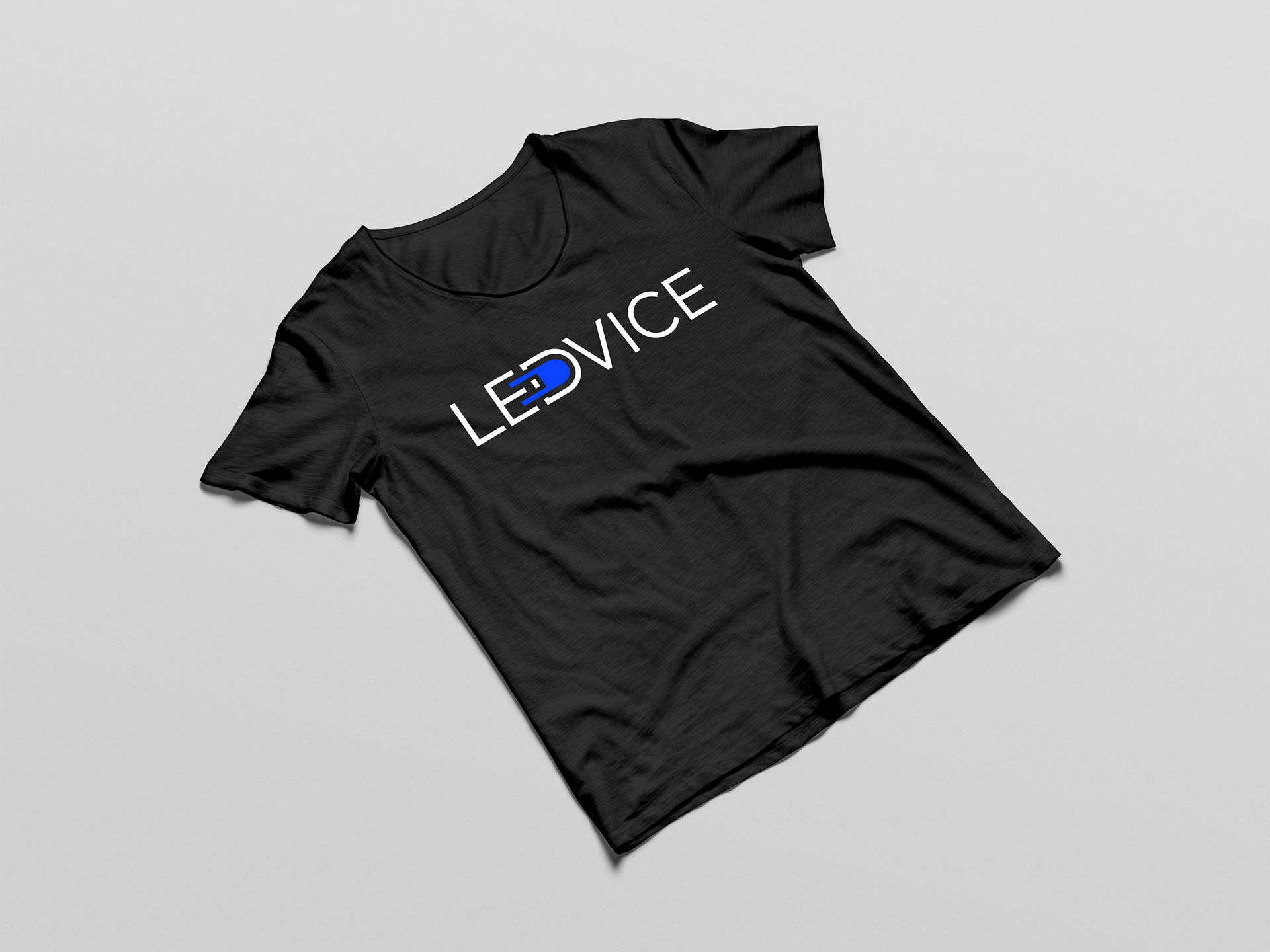
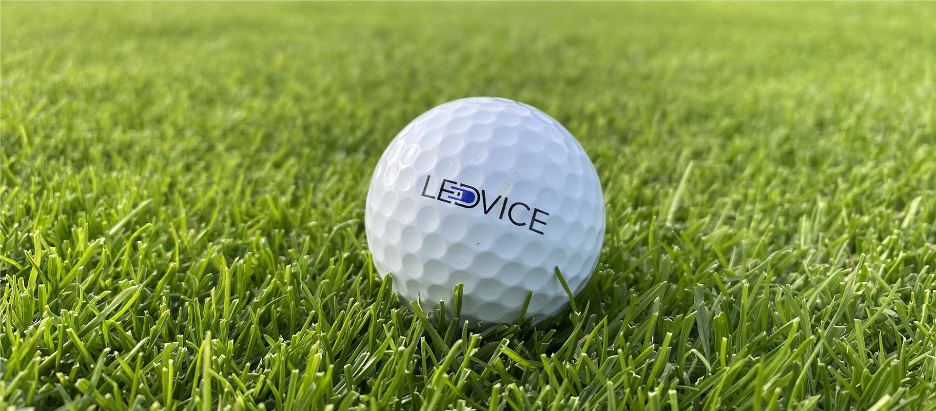
According to the brief the logo should be font based and be flexible enough size wise. The logo is planned to be used on a number of marketing goods, including golf balls. I should keep that in mind and keep it simple, so the logo could be clearly visible when printed on different materials.
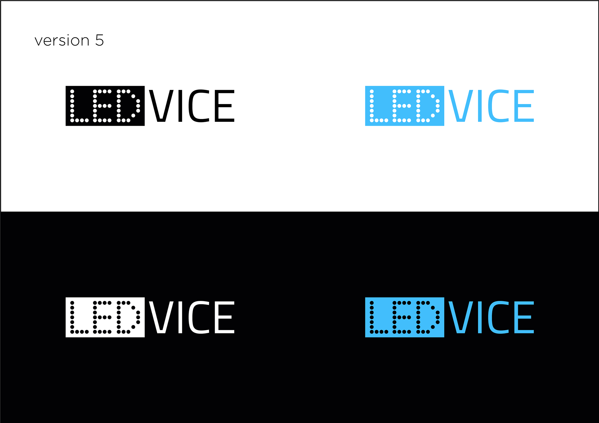
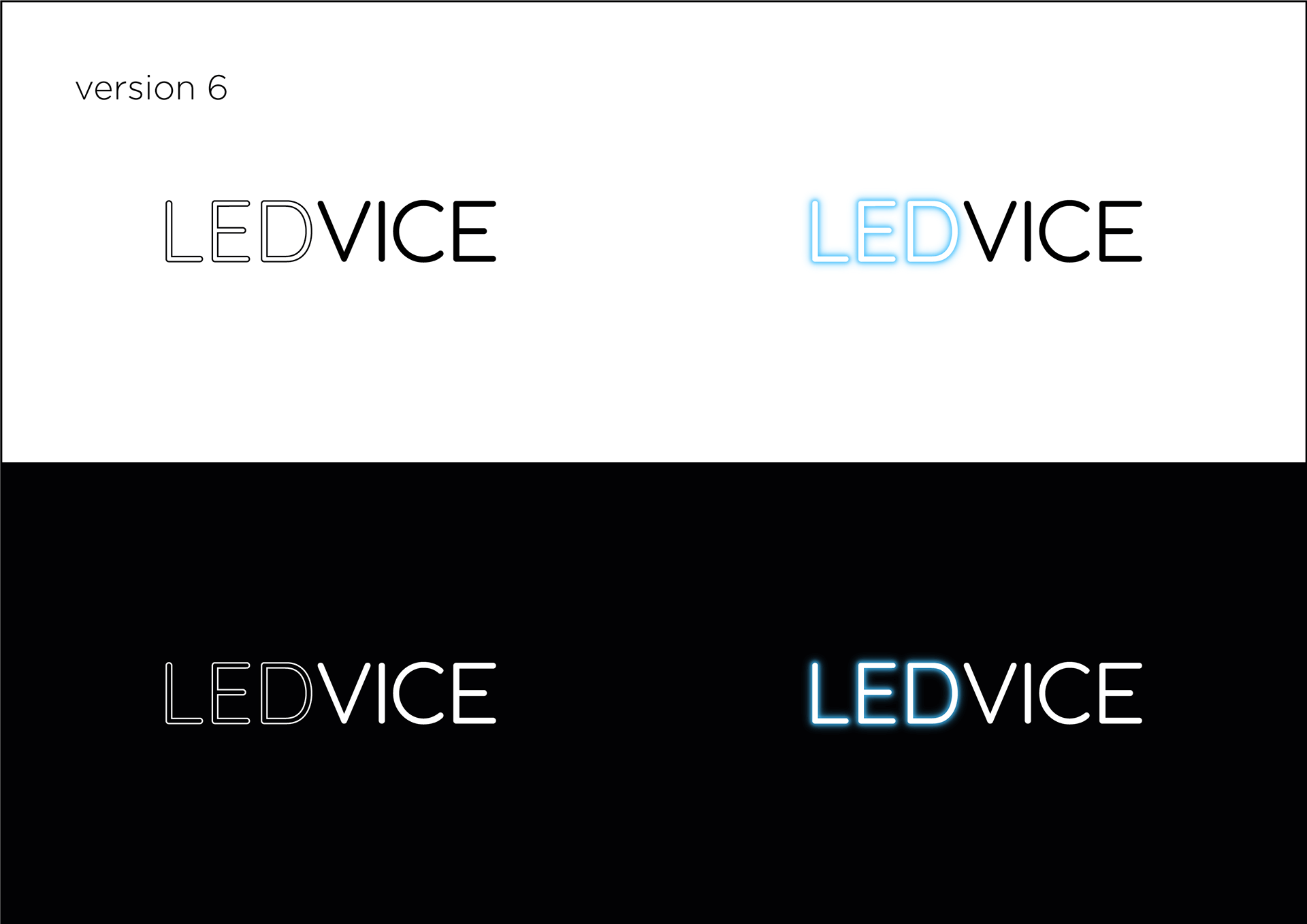
First, I offer 6 versions of the logo shape. I go for two variants – horizontal and square – from the beginning.
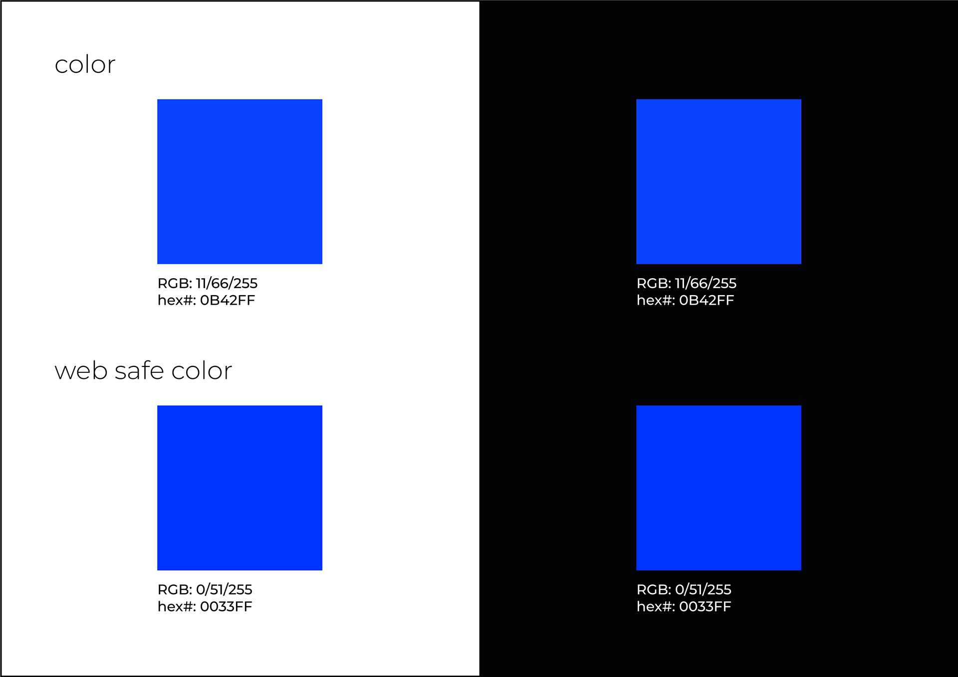
The client also briefed me about the color. They would like to stick to "almost corporate blue", but have it less boring.
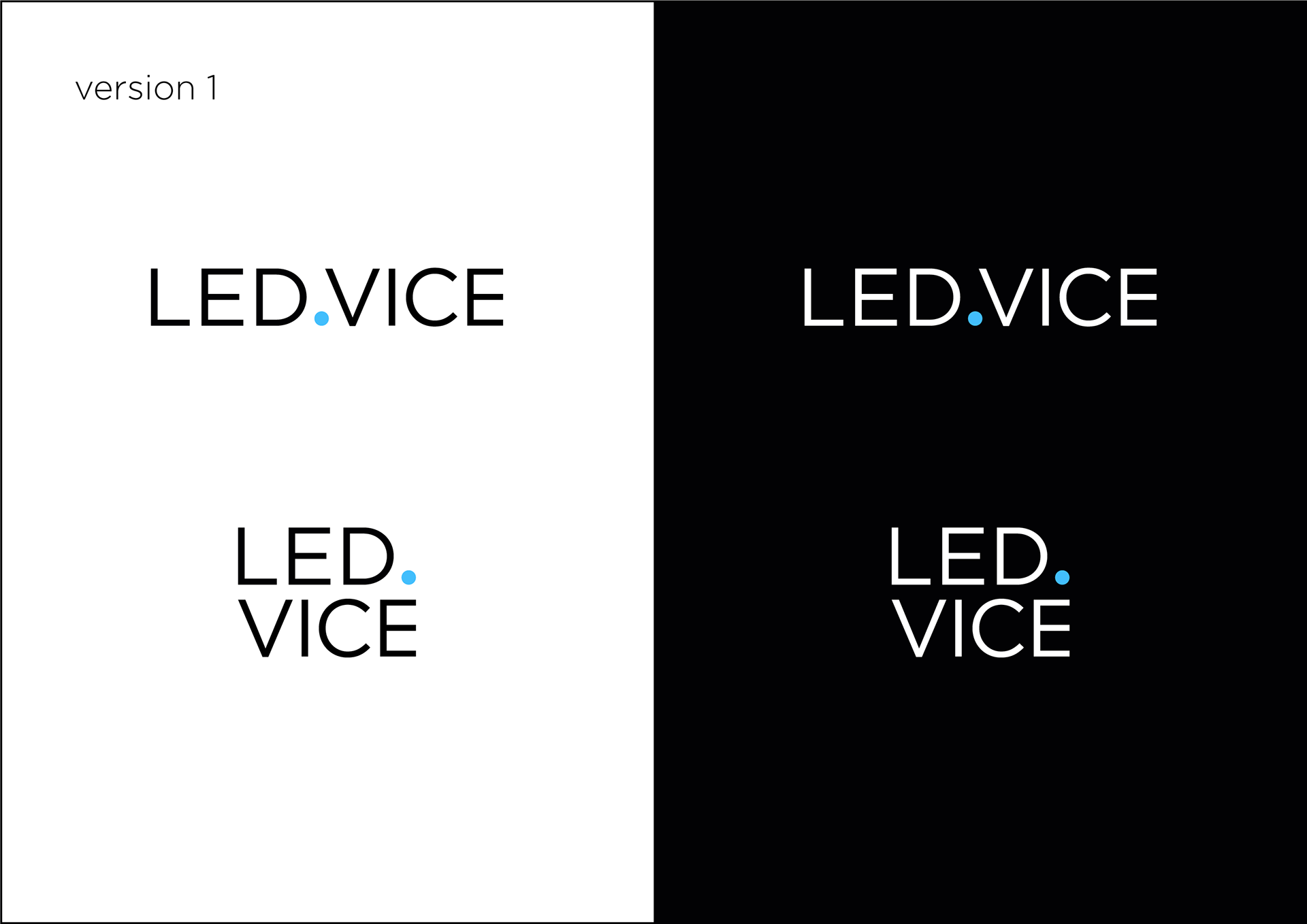
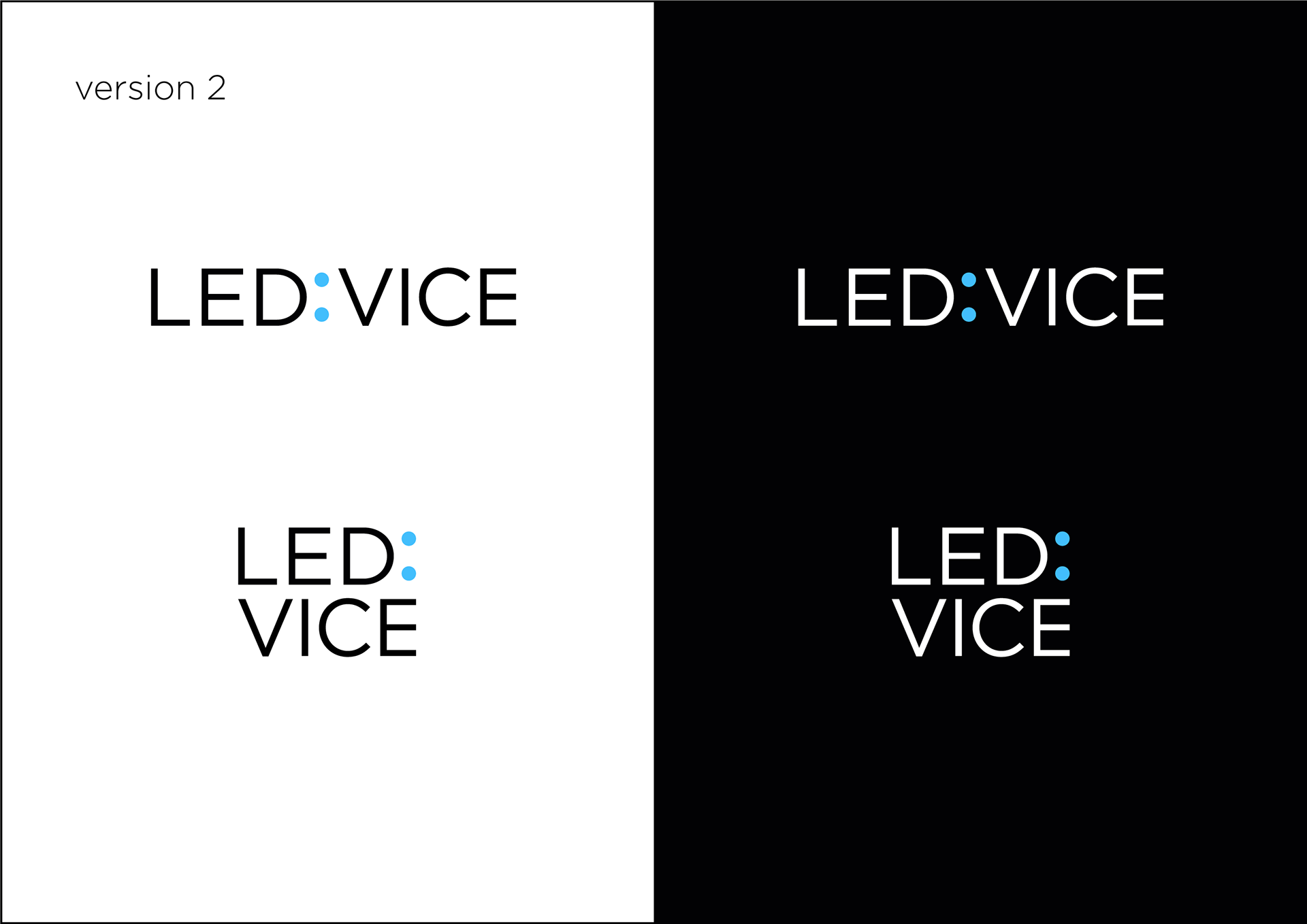
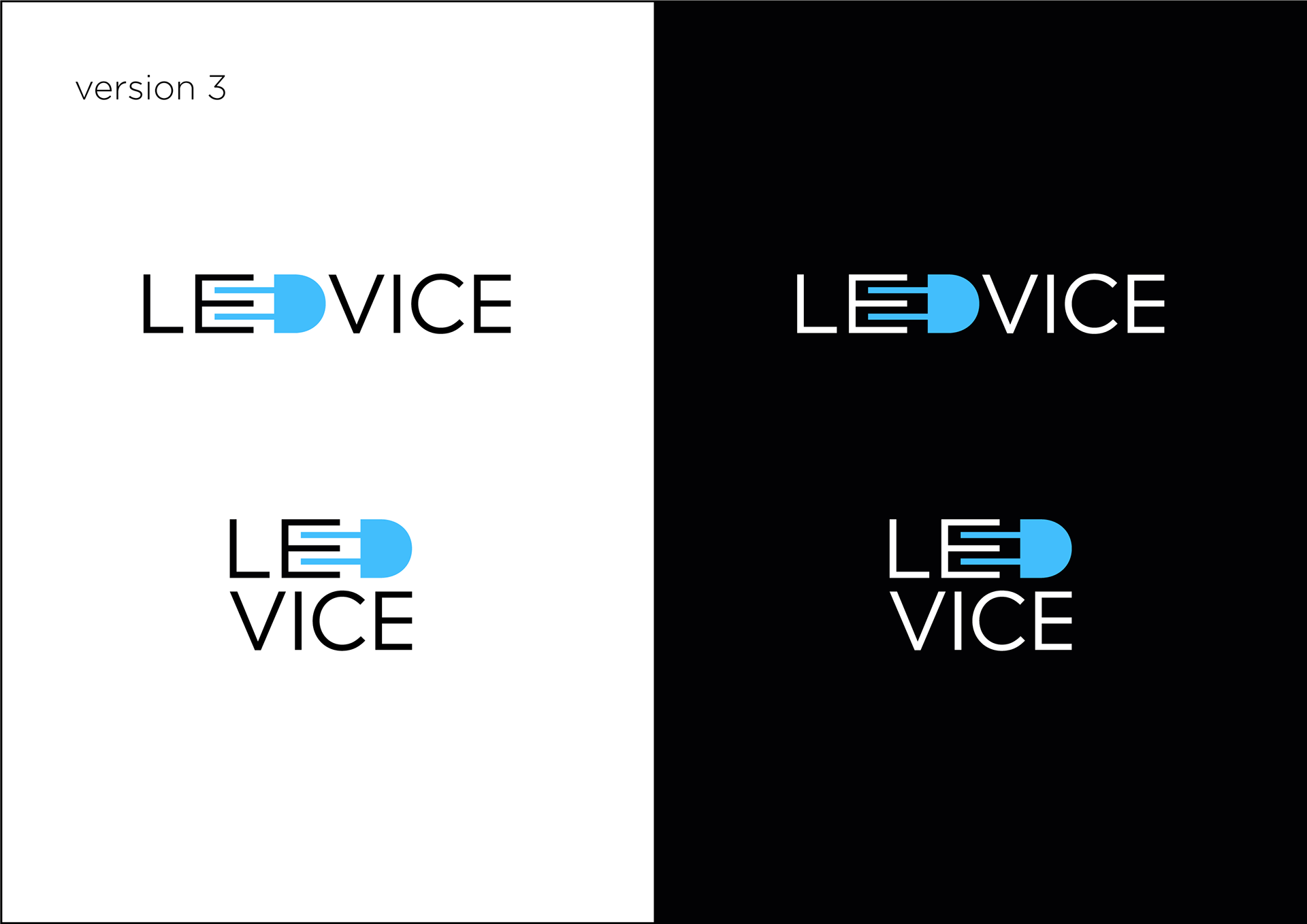
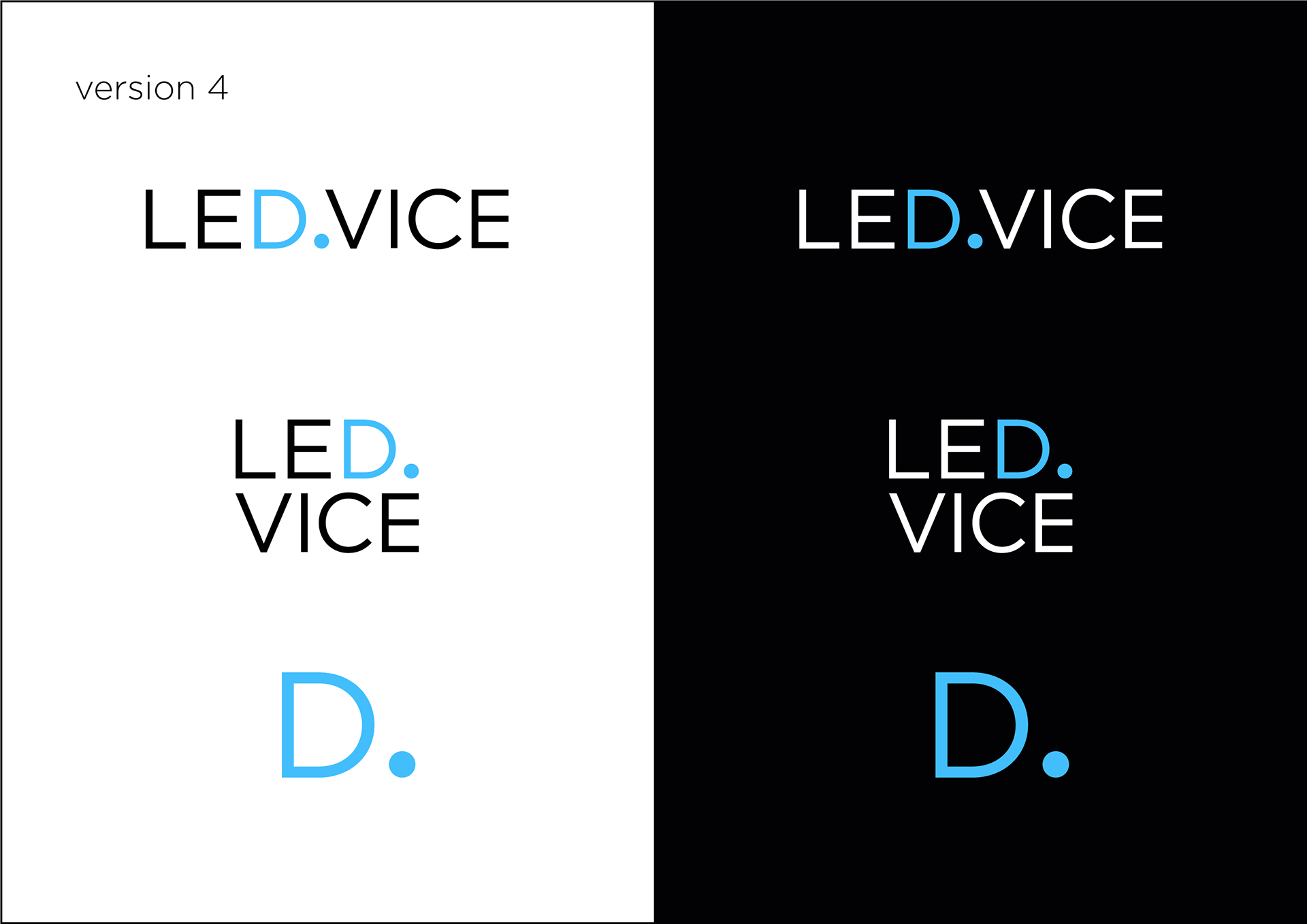
Out of the represented versions the client liked 3 and 4.
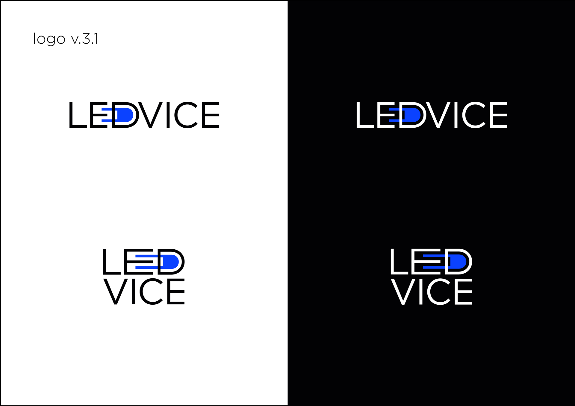
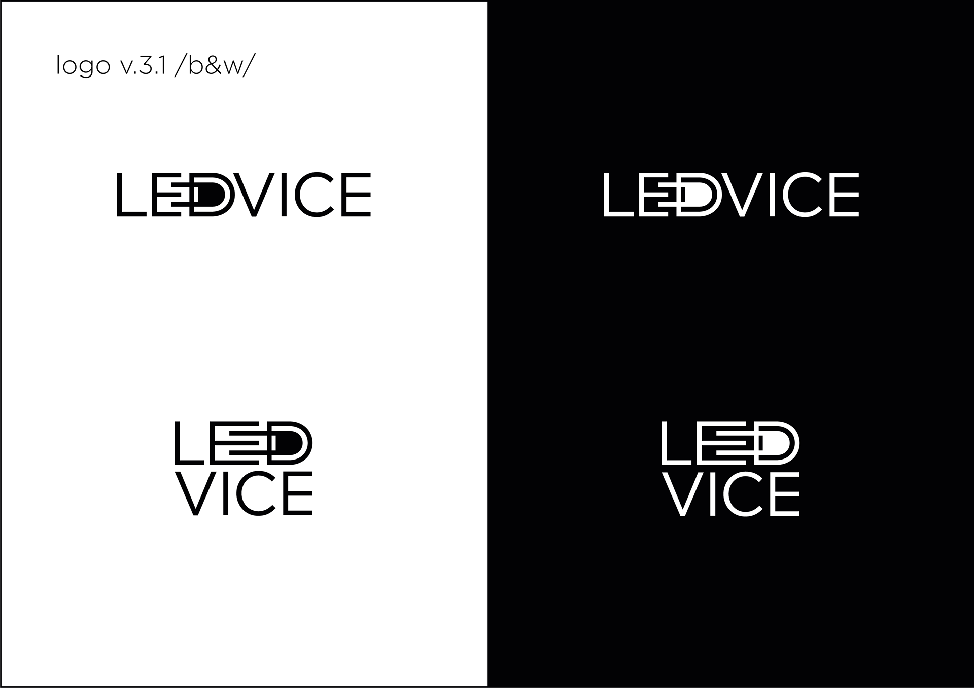
I played around with these versions trying to put them together.
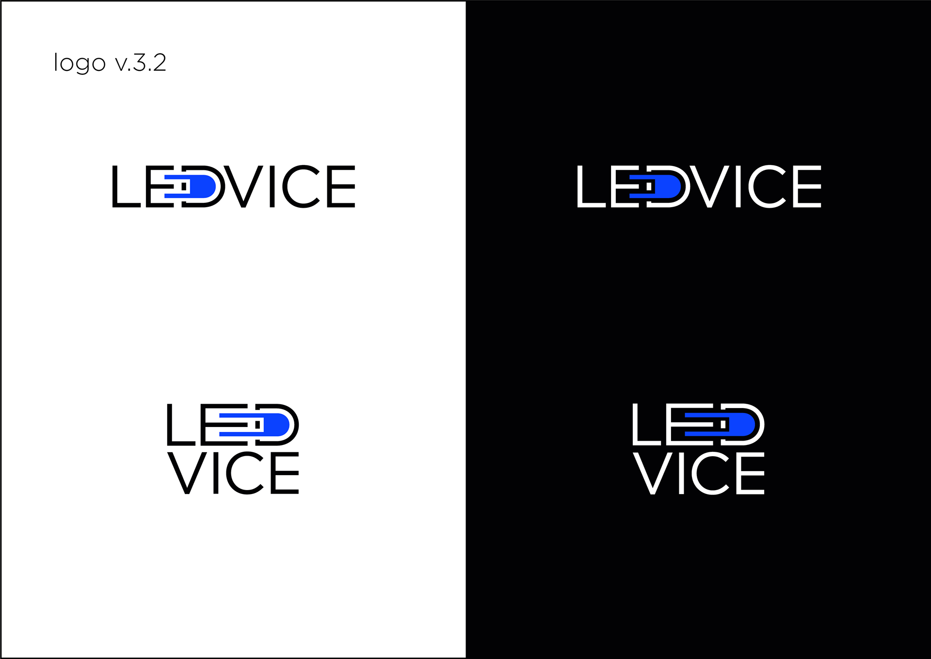
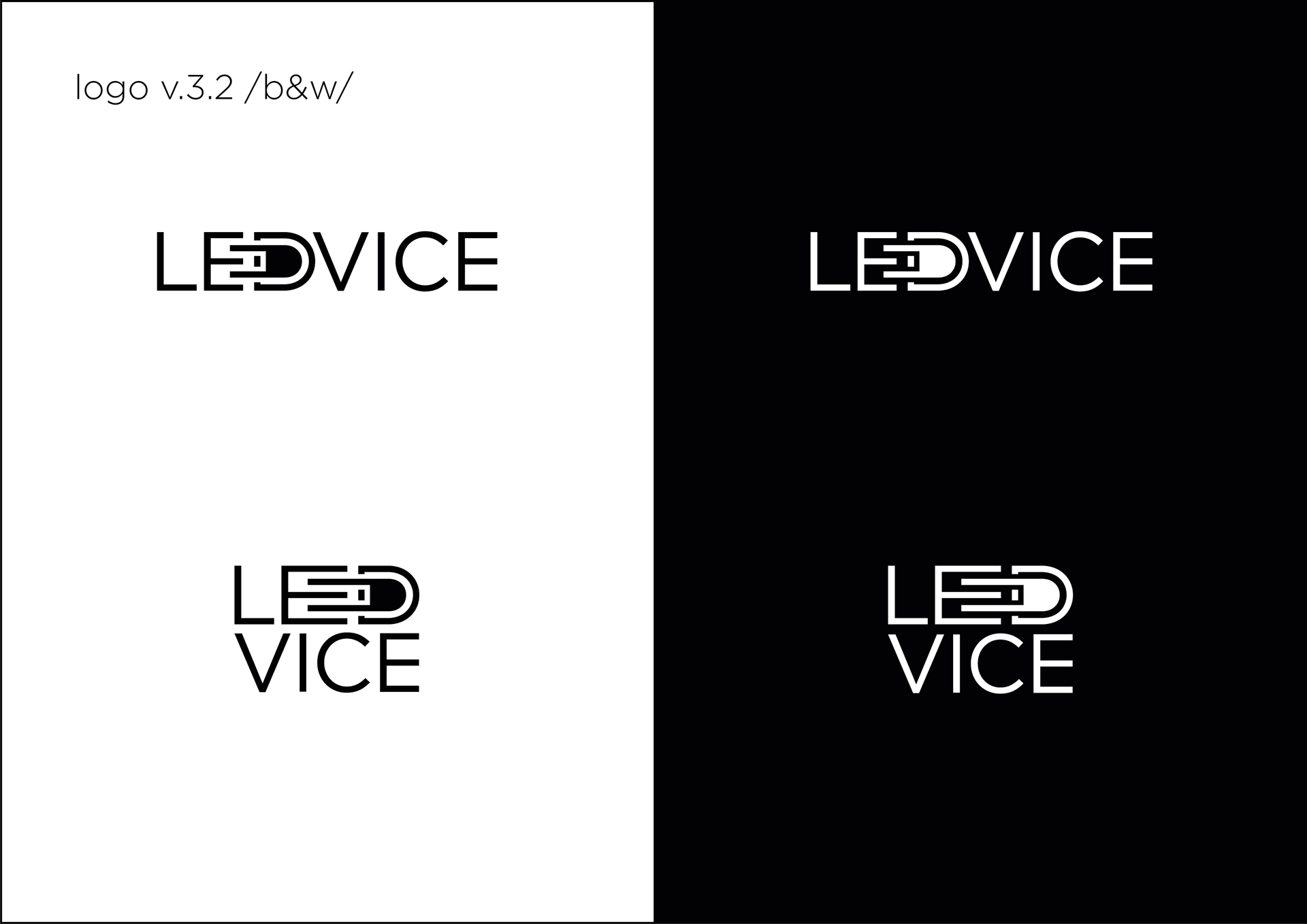
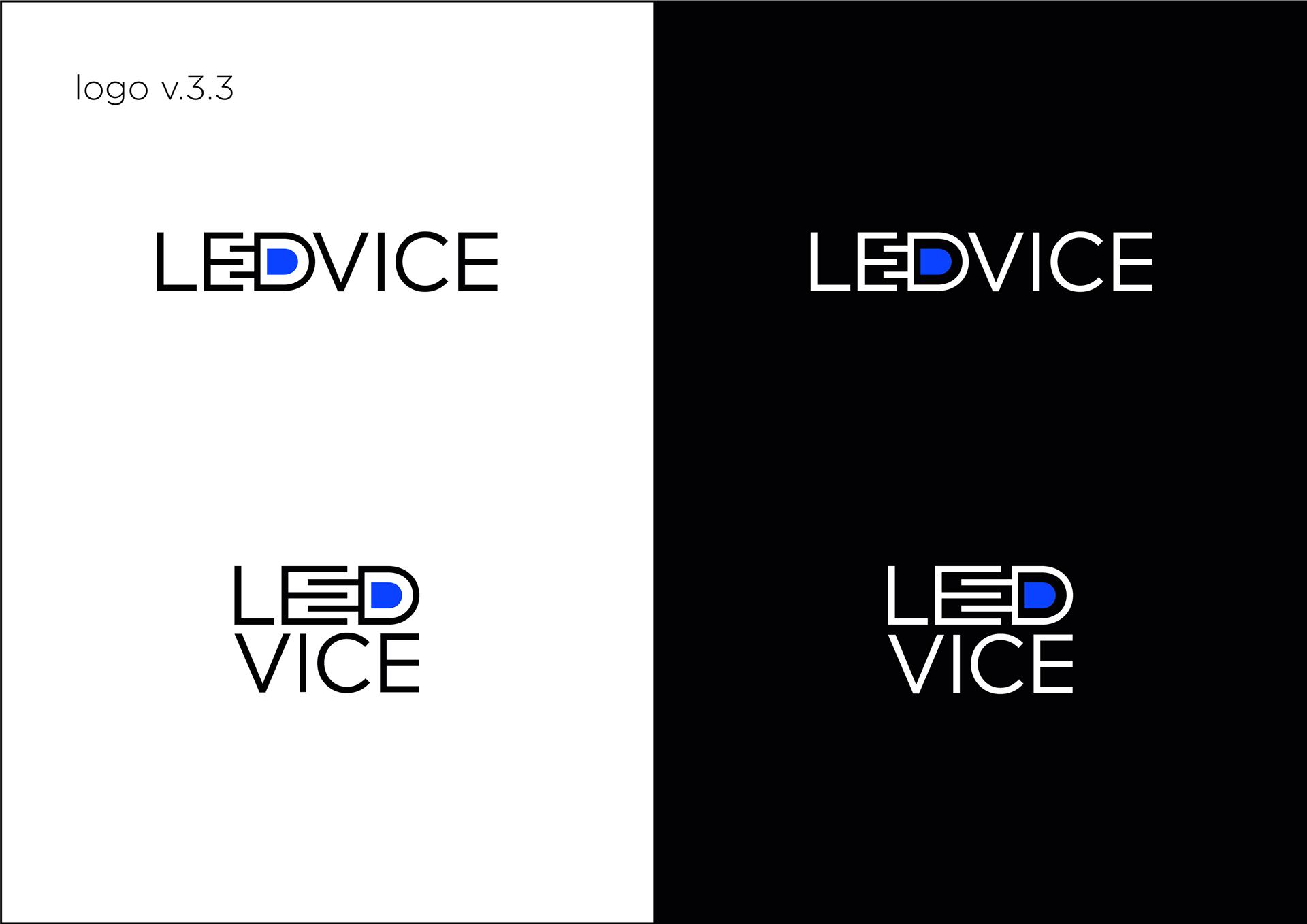
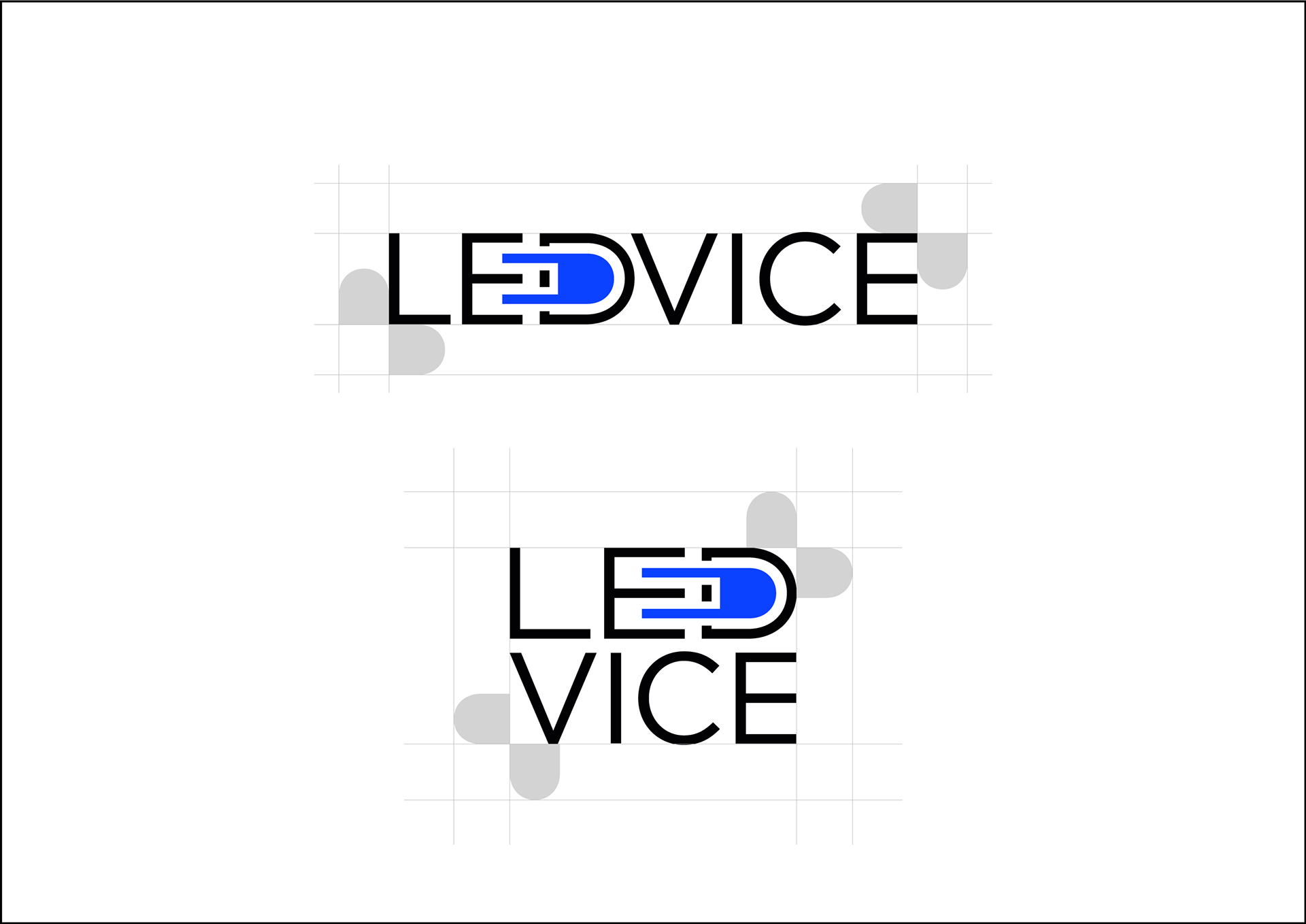
Logo v.3.2 was voted the best.
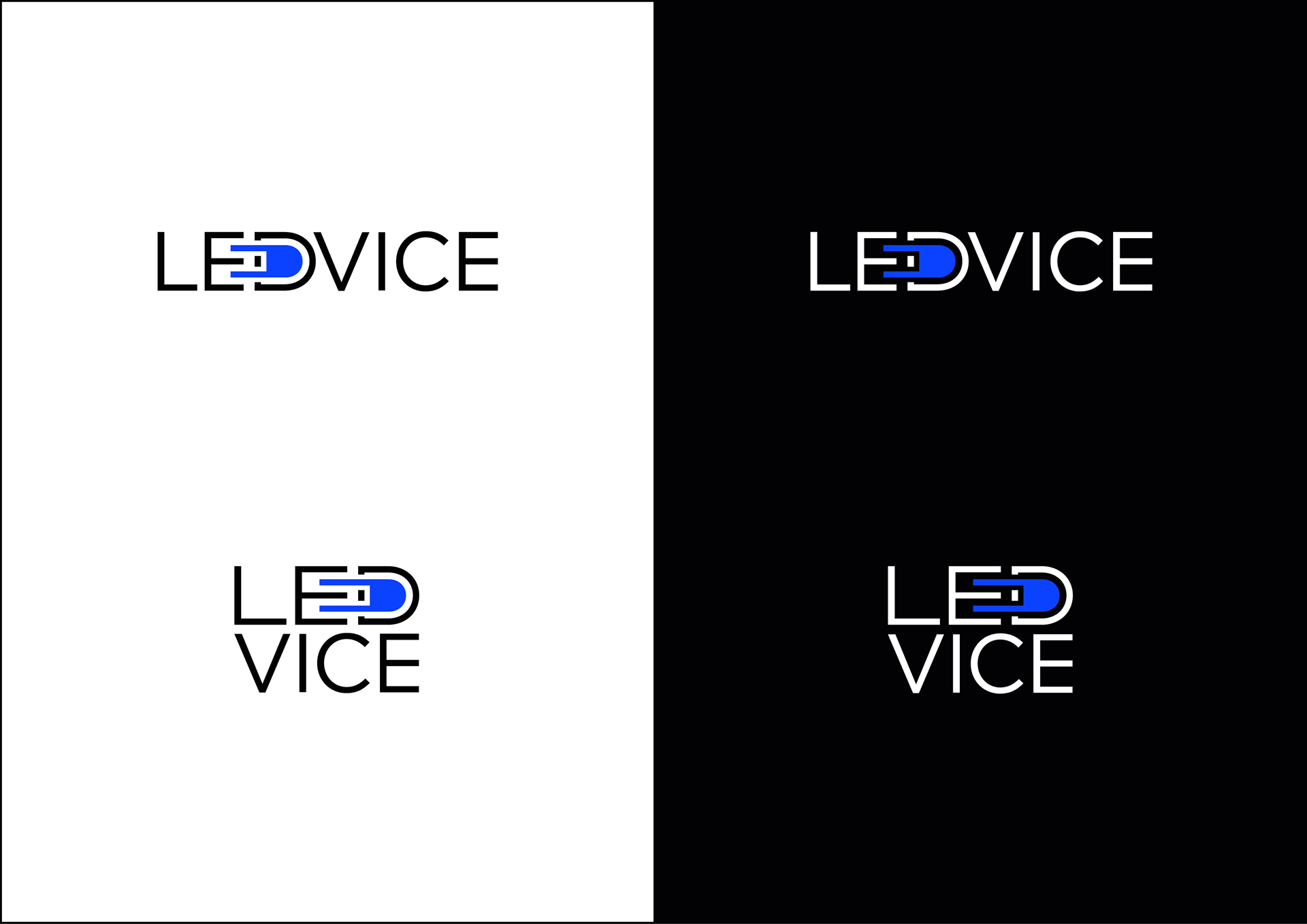
Its refined variant became the logo final.
Logo in color.
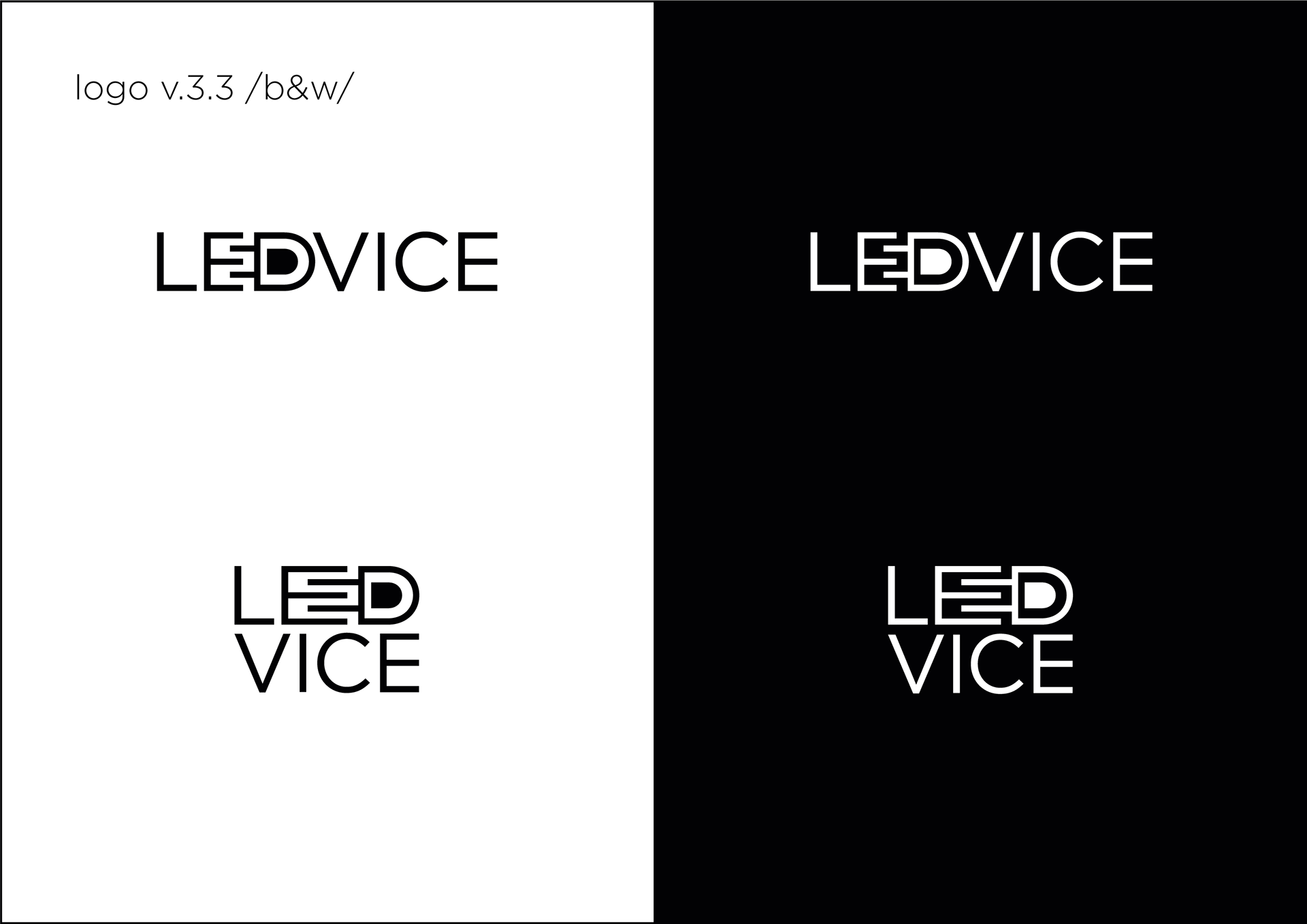
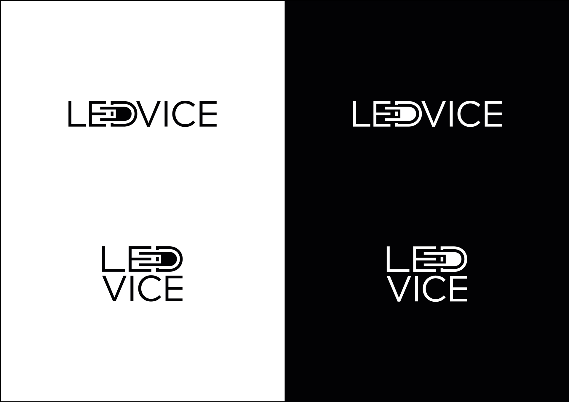
Logo in black and white.
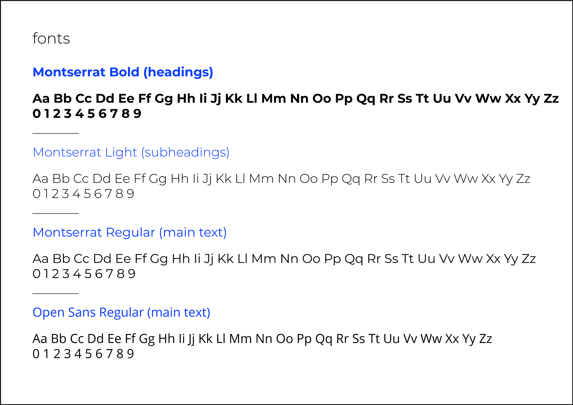
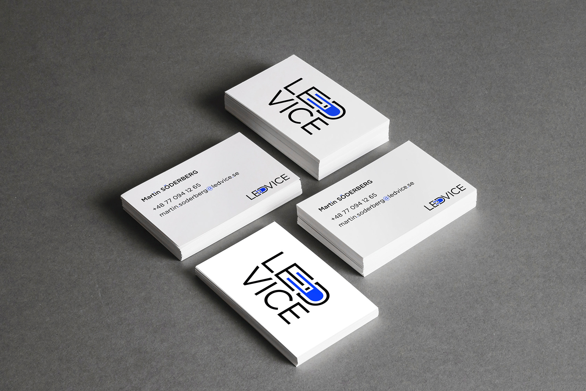
Along with the final logo files, the client received recommendations on logo usage, colors and fonts.
As well as some examples of the design applied.