simple manner
client: simple manner
Simple Manner is a middle class beauty salon in Kyiv.
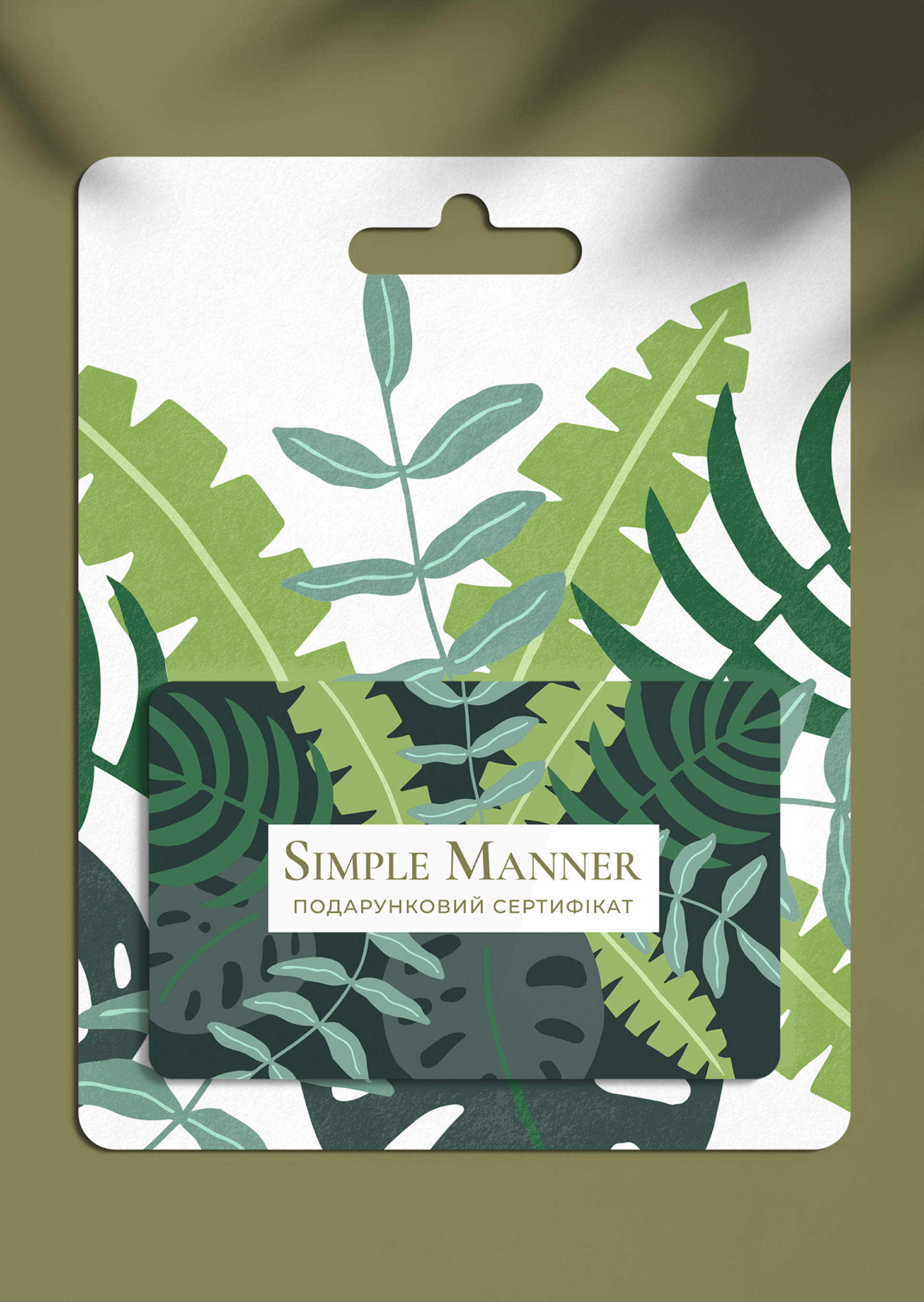
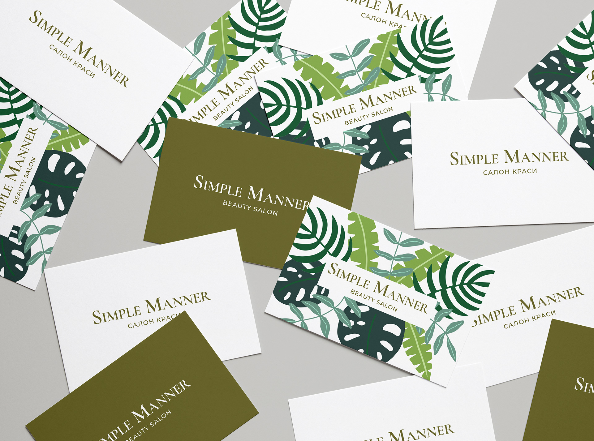
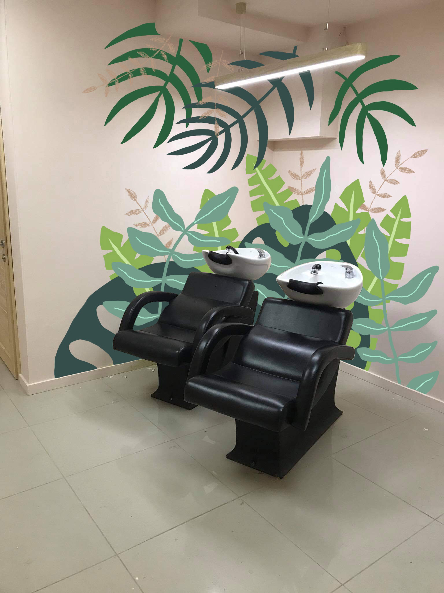
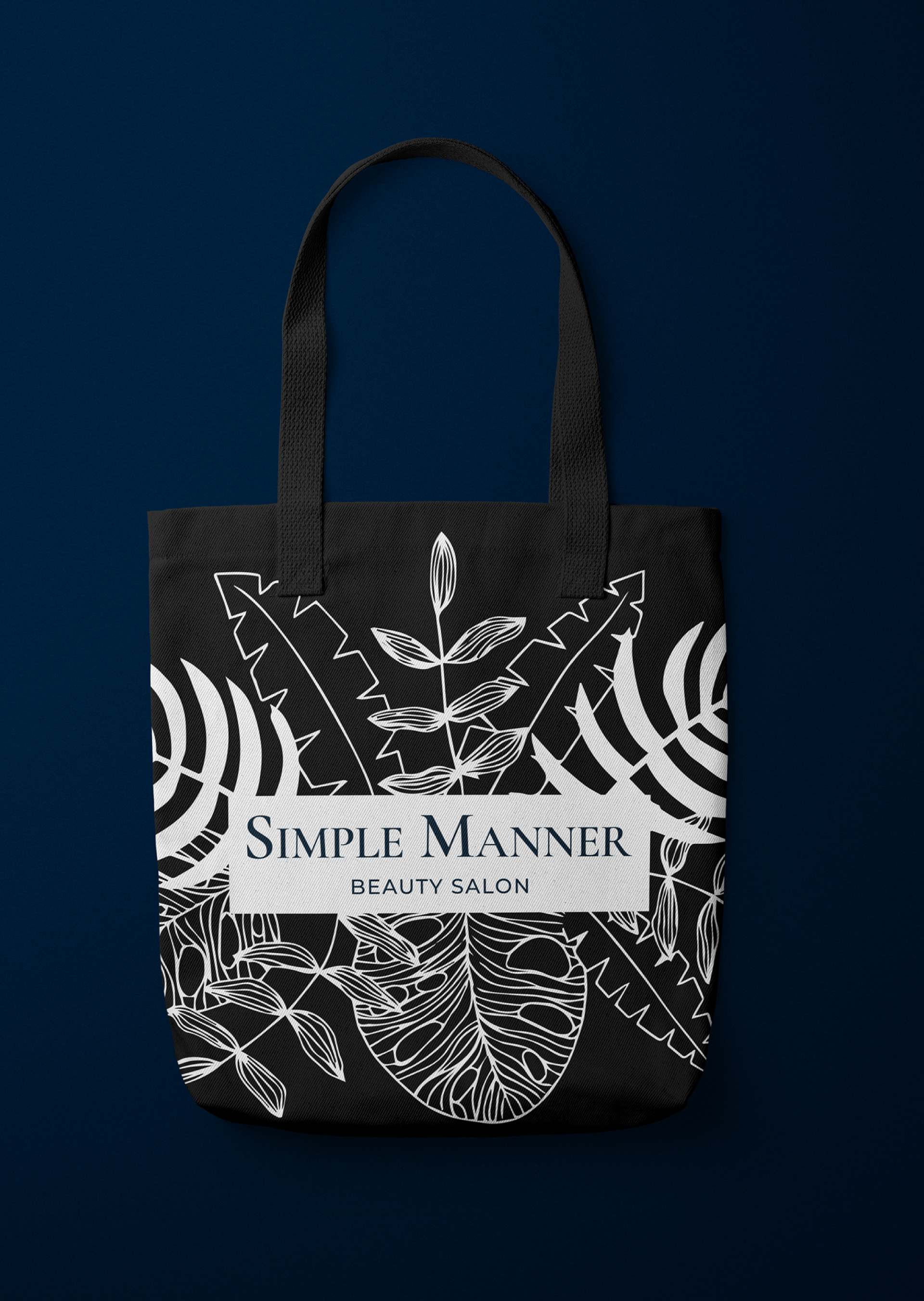
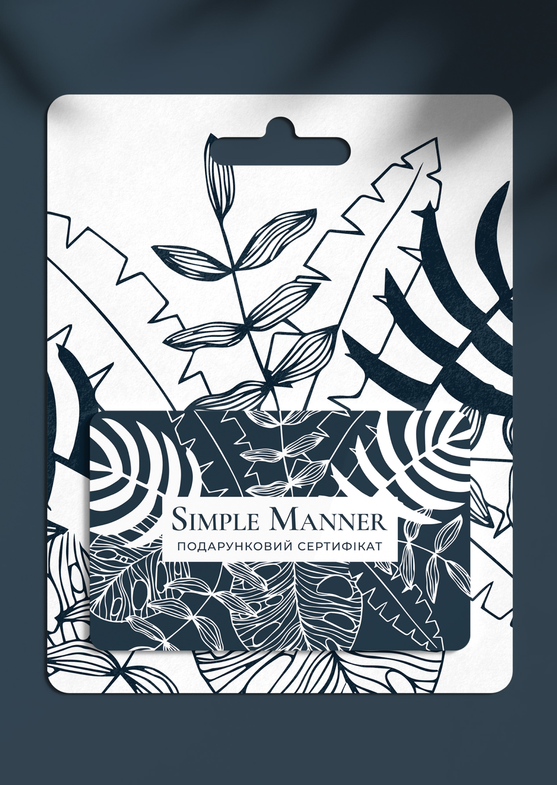
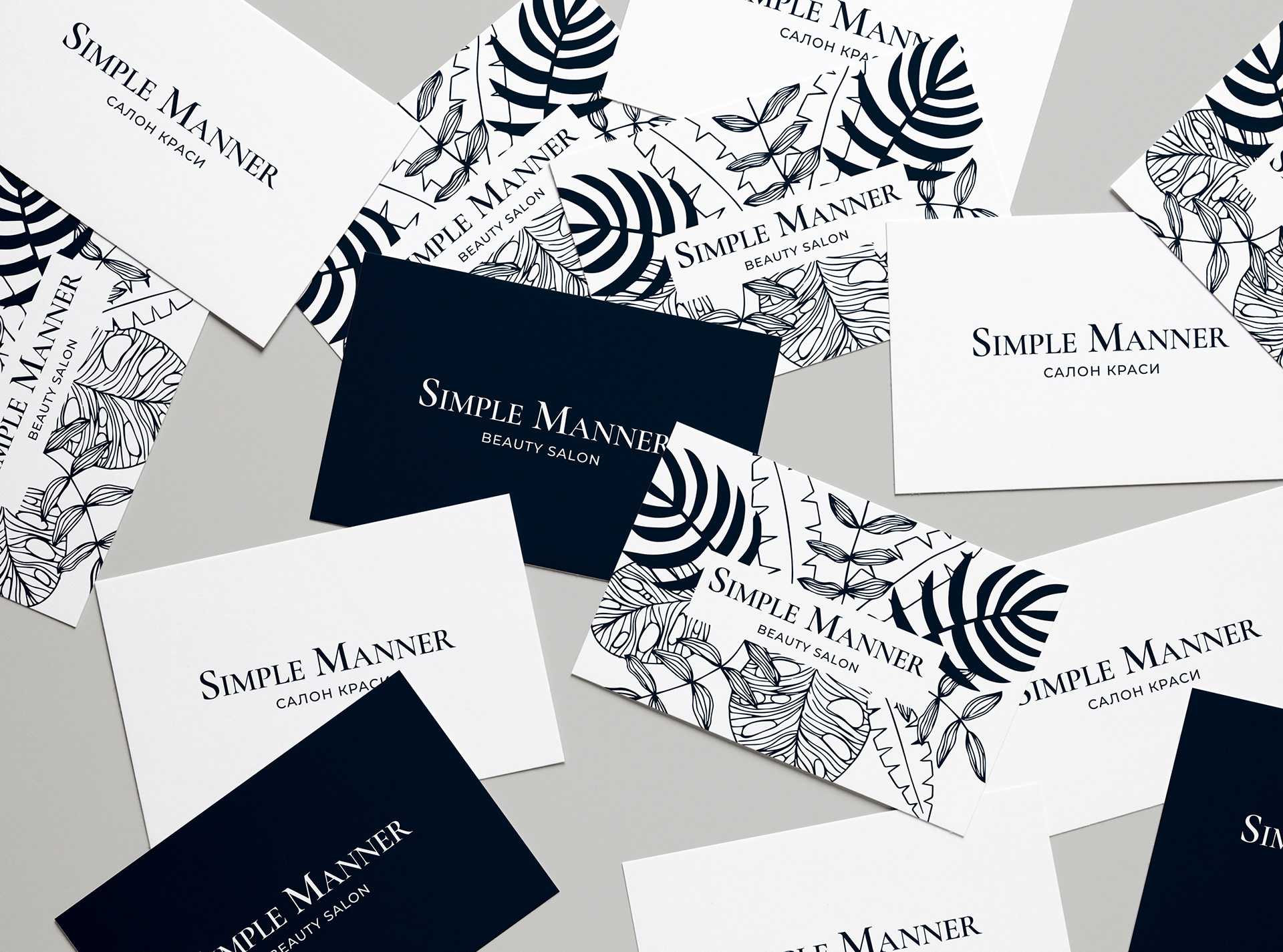
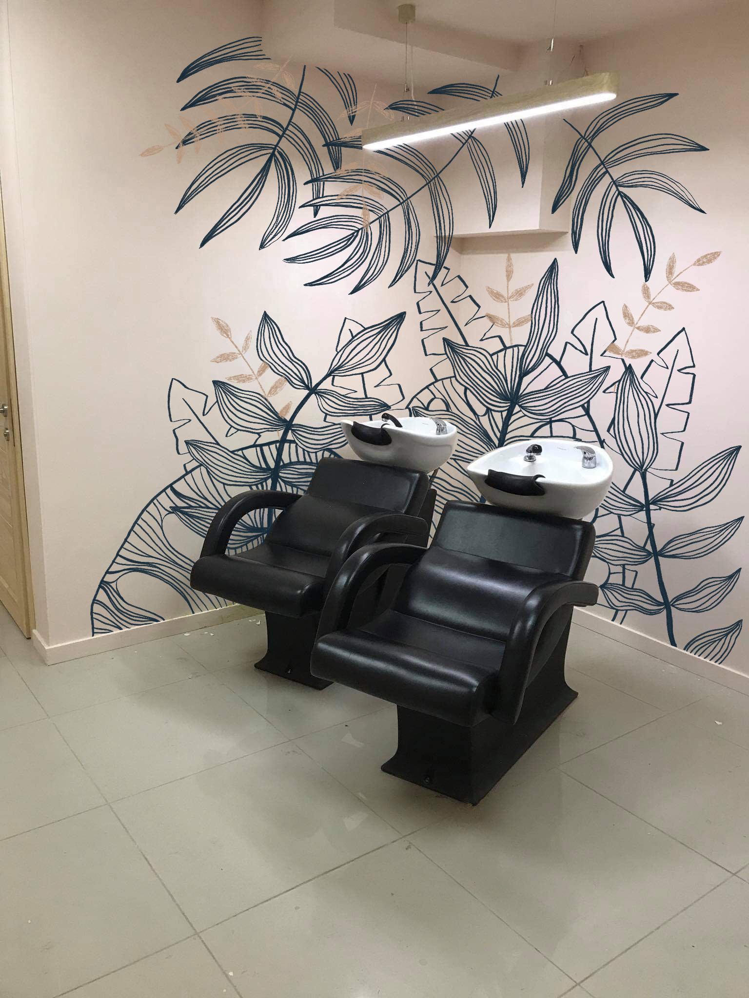
The client wanted the logo to feel elegant and expensive, yet modern and appealing for younger audience. Along with the logo, they needed a wall art design for one of the rooms in the salon. All design elements should be recognisable and adjustable for price lists, business cards, gift certificates and numerous marketing products.
In the first round I presented several directions where we could move with the design.
OPTION 1
- ink-like logo with minimalistic font
- "Beauty Salon" can be replaced with any slogan or collaboration
- abstract ink shapes are used as branding elements in patterns, decoration and wall art
- "Beauty Salon" can be replaced with any slogan or collaboration
- abstract ink shapes are used as branding elements in patterns, decoration and wall art
OPTION 2
- rounded logo font and bright colors
- colorful abstract elements
- colorful abstract elements
OPTION 3
- similar to the option 2, but with more limited color palette
- pattern of hand drawn beauty tools
- pattern of hand drawn beauty tools
OPTION 4
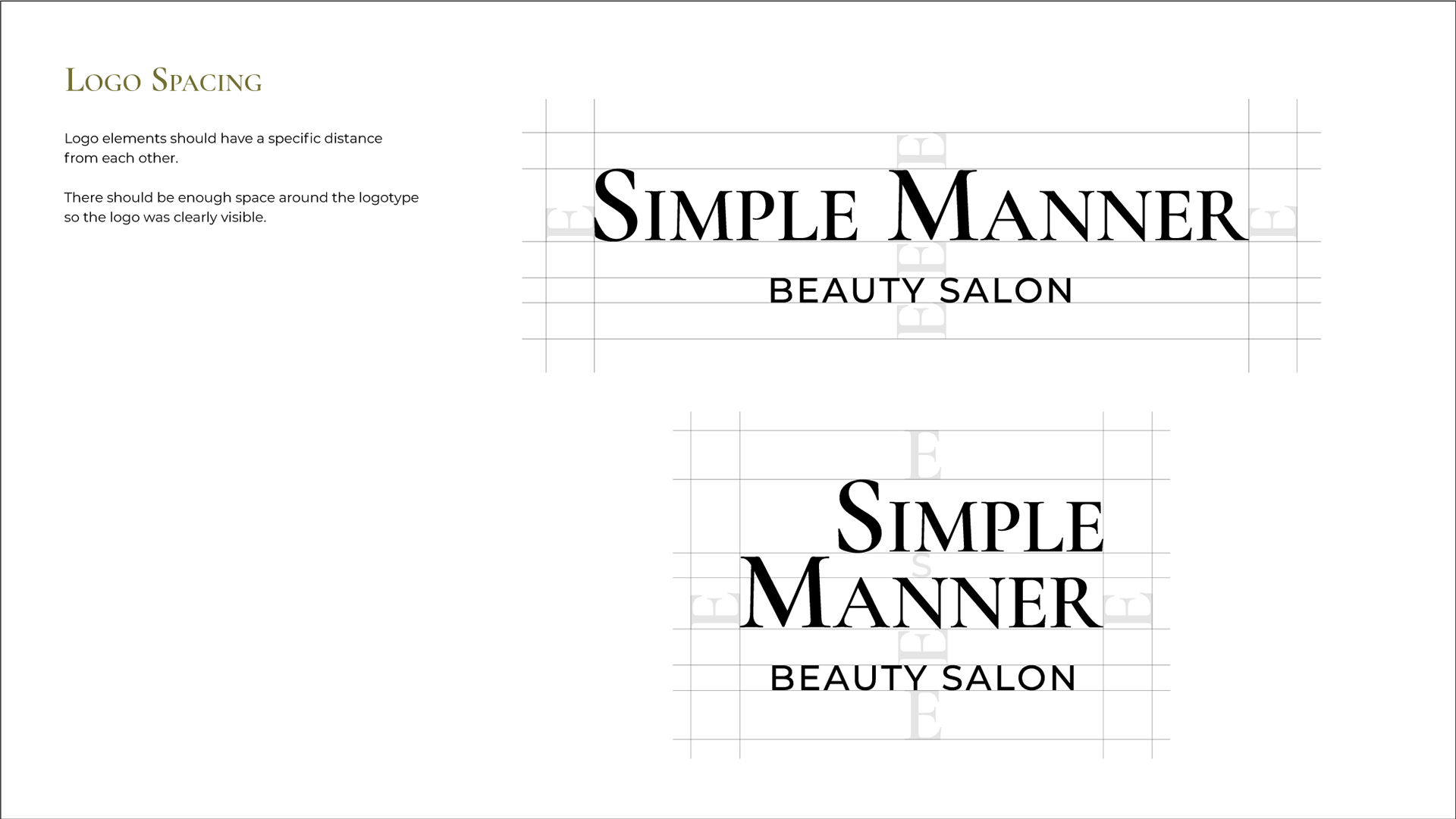
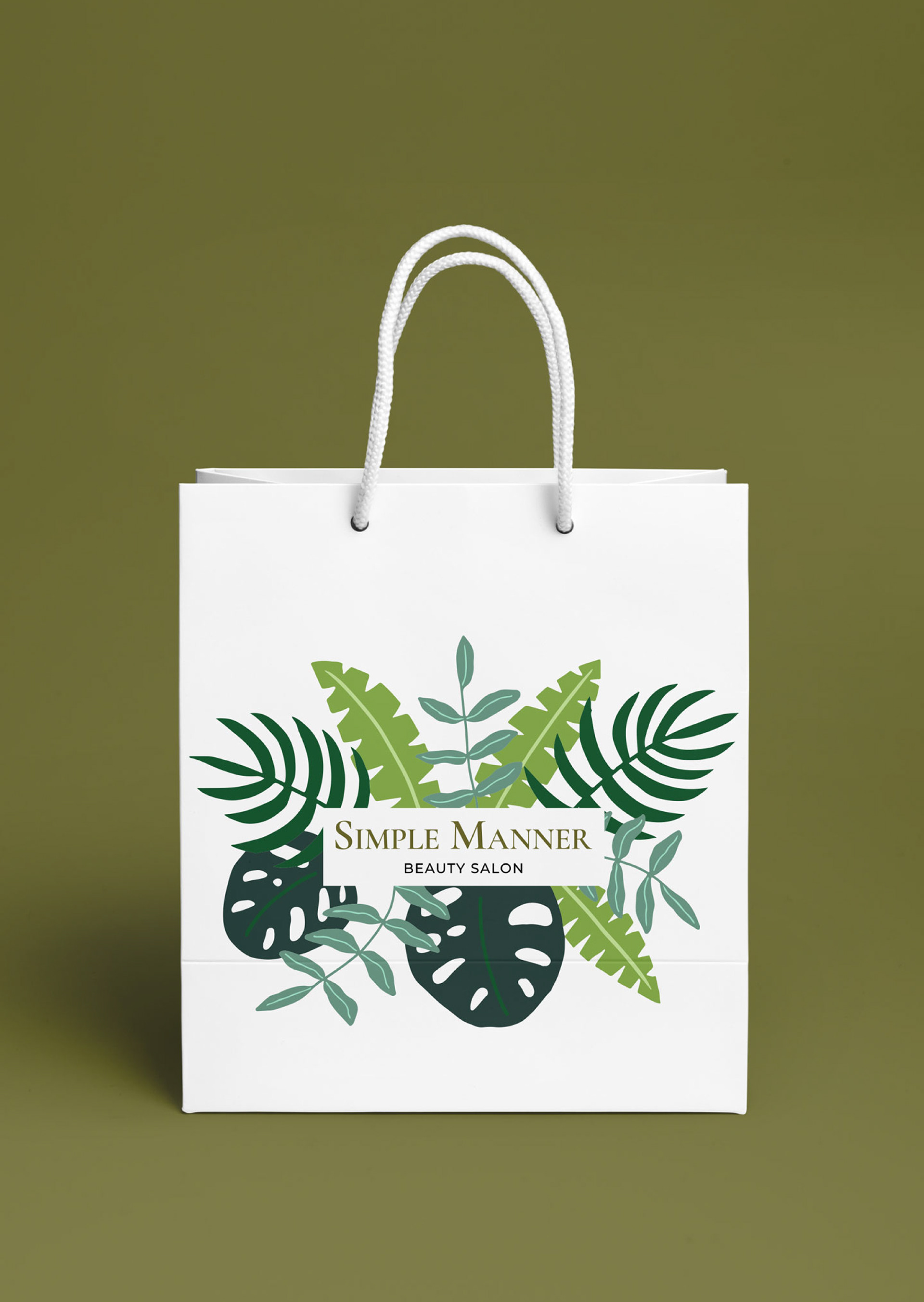
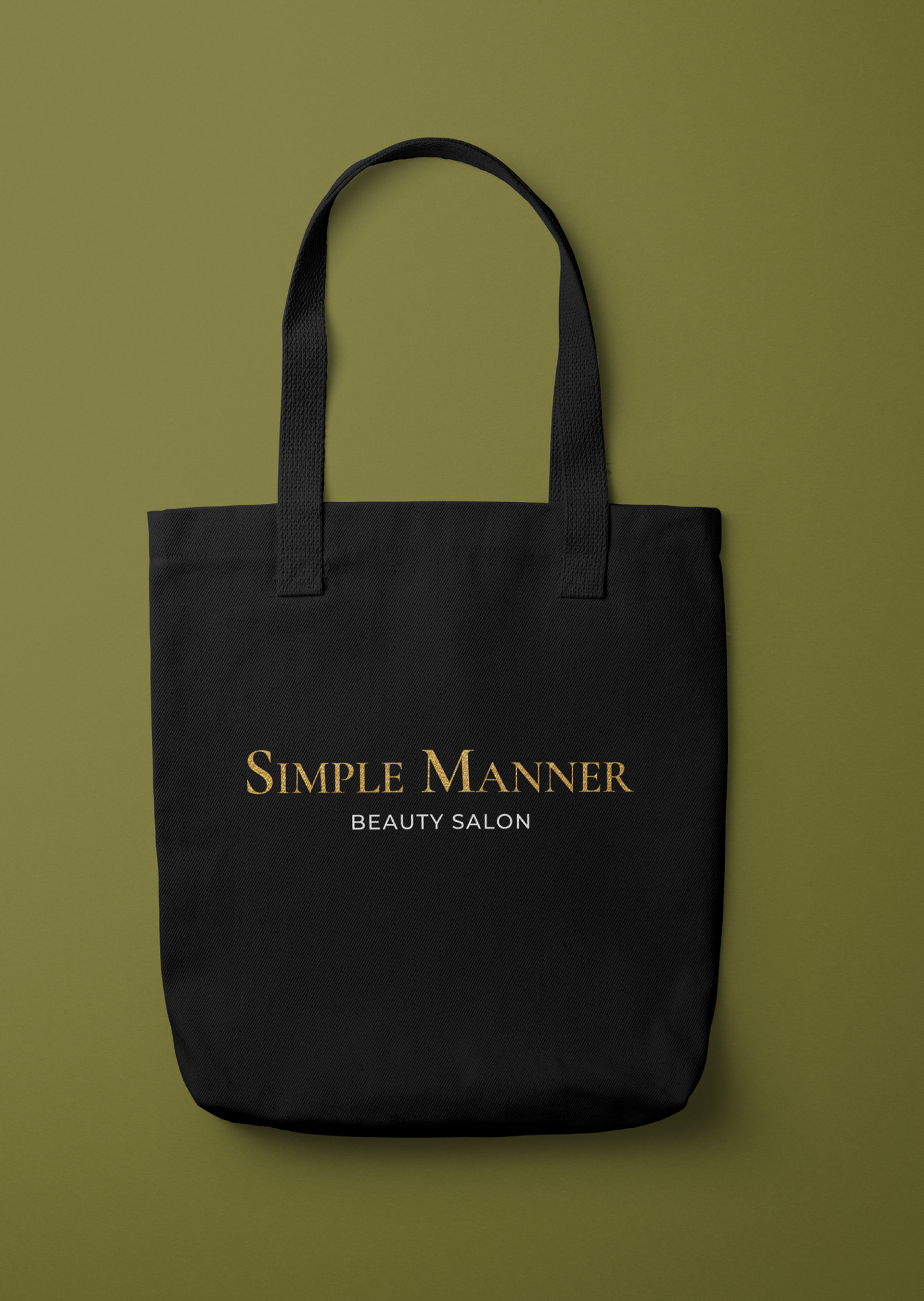
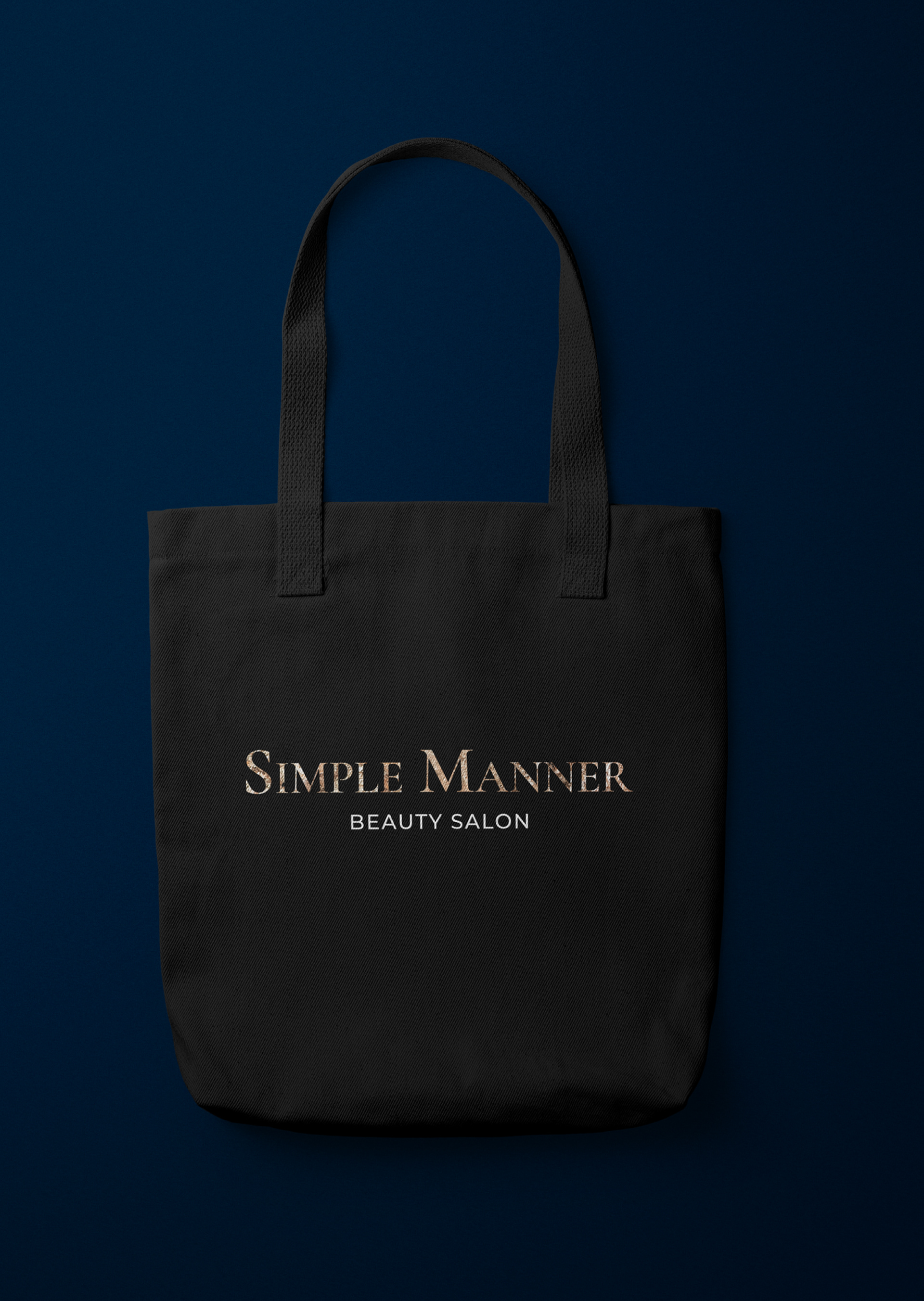
- logo that uses modern serif fonts specific for high fashion aesthetics
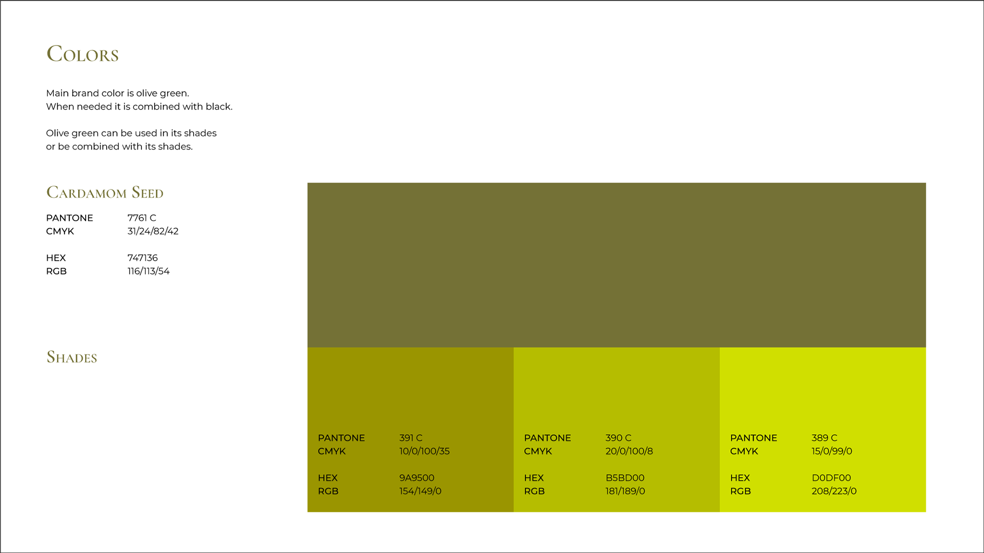
- muted olive green or black and golden
- botanical elements as decoration
- muted olive green or black and golden
- botanical elements as decoration
When Option 4 was chosen, I refined the logotype and suggested two color schemes and two wall decoration options.
GREEN + GOLD

BLUE + GOLD

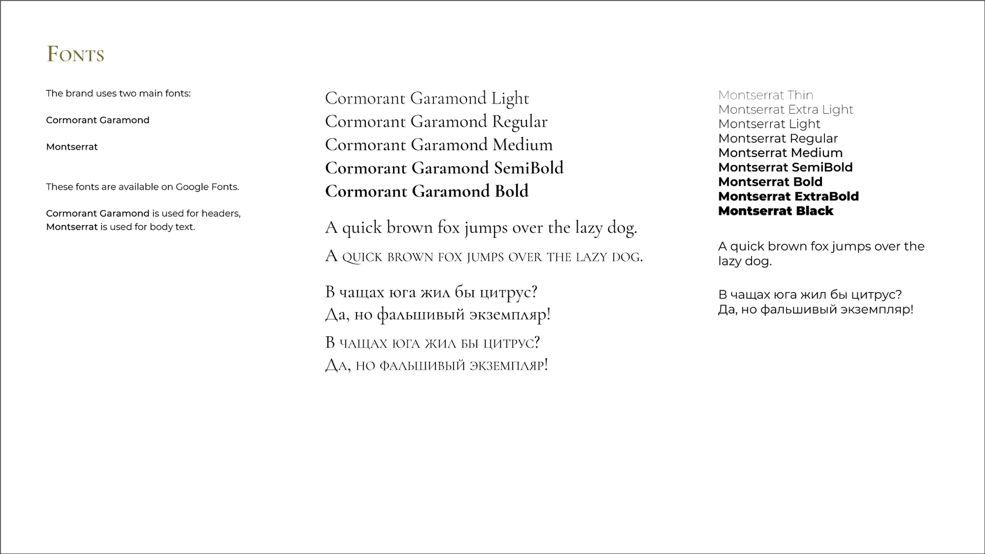
After Green option was chosen, I refined it and added recommendations on logo use, fonts and colors. Additionally, I created templates for the price lists and icons for Instagram highlights.
